Chapter 8 Tidyverse: another R Universe
Tidyverse exists and it is a dialect of R said Hadley Wickham25 at the RStudio::Conf 201726 about this single package that is an umbrella name for a coherent system of [multiple] packages for data manipulation, exploration and visualization that share a common design philosophy.27
In this chapter:
- Tidyverse goal
- Tidyverse packages
- Magrittr: pipes
- dplyr: pipeline demonstration
Hadley Wickham’s notes from the 2017 conference28 about Tidyverse:
1. It exists
2. It has a web site
3. It has a package
4. It has a book
Perhaps more importantly:
Goal: Solve complex problems by combining simple, uniform pieces.
The fundamental philosophy in Tidyverse is to separate commands and queries
A commands function performs an action
A query function computes a value
Examples:
Command: print(), plot(), write.csv(), <-
Query: summary(), sqrt()
Tidyverse is a package that installs a series of other packages. The fact that “it has a package” means that all packages composing Tidyverse can be installed with the single command:
install.packages("tidyverse")
instead of:
install.packages(c(
  "broom", "dplyr", "feather", "forcats","ggplot2", "haven",
  "httr", "hms", "jsonlite", "lubridate", "magrittr",
  "modelr", "purrr", "readr", "readxl", "stringr", "tibble",
  "rvest", "tidyr", "xml2"
))Study: Watch the first 30 minutes of Hadley Wickham’s keynote presentation at RStudio::Conf 2017 - February 10, 2017
In the next sections we’ll explore the packages that may be useful for analysis of tabular data such as NHANES data.
8.1 Magrittr - pipe and pipelines
In English a “pipe” can designate an object to smoke tobacco or house plumbing. In both cases it can be viewed as a hollow cylinder.
In computing a “pipe” is a method to create a data stream in the memory of the computer without the need to create intermediary files or R objects. In Unix the pipe is represented by a vertical bar: | but in R the pipe is represented by:
\[\%>\%\]
In English, when reading code, it is useful to replace the pipe with and then to better understand the successive passage of each step or function.
Once started with data from an object the resulting stream of data can be modified by a function and then passed on to the next function, and then the next etc. The flow of data can be conceptualized as a flow of water going through pipes until it exits (figure 8.1.)

Figure 8.1: Imagining the data strem as a flow of water in pipes.
The stream of data can be modified by successive function, each passing the data stream along the “pipe” to the next function until the final result (8.2.)
Figure 8.2: The pipe operator is the conduit for the data stream.
There can be more than one operation until the final result.
The command-query distinction is useful for pipes
The body is made up of queries
Every pipe is ended by a command
The use of pipe can help create pipelines to manipulate, convert, gather, select data in a way that ends in a final result without the need of intermediate items, as all happens while “in transit” within the conduits.
The pipe is widely used in the context of Tidyverse but it is not restricted to that Universe and can find its uses in writing R commands.
Study: Watch the 25 min RStudio::Conf 2017 by Bob Rudis:
The name of the package is derived as a reference to the famous surrealist painter René Magritte 1929 image “this is not a pipe” as an image is not the object itself. This image is now at the Los Angeles County Museum of Art.
8.2 Tibble
A “tibble” is a data frame, but a modern reimagining of the data.frame class. {tibble!data frame}
![]() From the Tidyverse Tibble web page31: Tibbles are data.frames that are lazy and surly: they do less (i.e. they don’t change variable names or types, and don’t do partial matching) and complain more (e.g. when a variable does not exist). This forces you to confront problems earlier, typically leading to cleaner, more expressive code. Tibbles also have an enhanced
From the Tidyverse Tibble web page31: Tibbles are data.frames that are lazy and surly: they do less (i.e. they don’t change variable names or types, and don’t do partial matching) and complain more (e.g. when a variable does not exist). This forces you to confront problems earlier, typically leading to cleaner, more expressive code. Tibbles also have an enhanced print() method which makes them easier to use with large datasets containing complex objects.
As far as we are concerned we do not have to worry about that as Tidyverse packages work fine with data frames. We’ll just see the word “tibble” appear when working with the Tidyverse functions and that’s simply what it is.
One difference in the print out of a table of data from a data frame in a tibble form is that we’ll see the data type printed under the column name such as <chr> for character column, <int> for integers and <dbl> for “double-precision decimal number.”
Trivia
The Tibble logo font character for letters T and E are very close in shape (but not the B) but could the tibble name also be related to the famous sweet “tribble” creature on the original Star Trek. Or is it a New Zealander way of pronouncing “table”?
Who know? (perhaps H W does?)

Figure 8.3: Is the Tibble logo a hint on Star Trek?
8.3 dplyr - overview
From dplyr.tidyverse.org/:
dplyr is a grammar of data manipulation, providing a consistent set of verbs that help you solve the most common data manipulation challenges.
select() picks variables based on their names. (columns)
filter() picks cases based on their values. (rows)
arrange() changes the ordering of the rows.
mutate() adds new variables that are functions of existing variables.
summarise() reduces multiple values down to a single summary.
These all combine naturally with group_by() which allows you to perform any operation “by group”.
8.3.1 Demo 1: all together pipeline
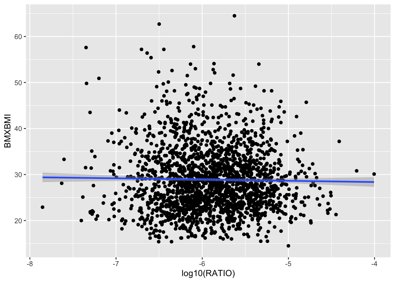
Before we go into details of the various verbs that make dplyr poweful, let’s first create a pipeline as an example of the power of the Tidyverse methods: with one series of commands and queries we’ll recreate one of the plots of figure 7.2 “just like that!” with no need of any intermediate steps or temporary objects.
We’ll start with our master file Master4 “injected” into the pipeline and then we’ll:
- select specific columns (automatic subset)
- filter out rows that have
NA - compute the
RATIOfor creatinine ajustment (mutate) - plot the data with
qplot()and include automatic linear regression.
Now here’s the code - discussed further below:
First, we need to make sure that tidyverse is loaded:
Then we run the pipeline:
# pipeline demo 1
Master4 %>%
select(SEQN, LBXMFOS, URXUCR, BMXBMI) %>%
filter(!is.na(LBXMFOS)) %>%
# head() %>%
mutate (RATIO = (LBXMFOS/URXUCR)*10^-4) %>%
qplot(log10(RATIO), BMXBMI,  data = ., geom = c("point", "smooth"))
`geom_smooth()` using method = 'gam' and formula = 'y ~ s(x, bs = "cs")'
Figure 8.4: A pipeline to recreate scatter plot of BMI values as s function of log10 RATIO creatinine adjustment for the sum of PFAS data column LBXMFOS.
Here are a few more details about the code, and let’s see if we follow the The command-query distinction useful for pipes
- The body is made up of queries
- Every pipe is ended by a command
But what about the beginning?

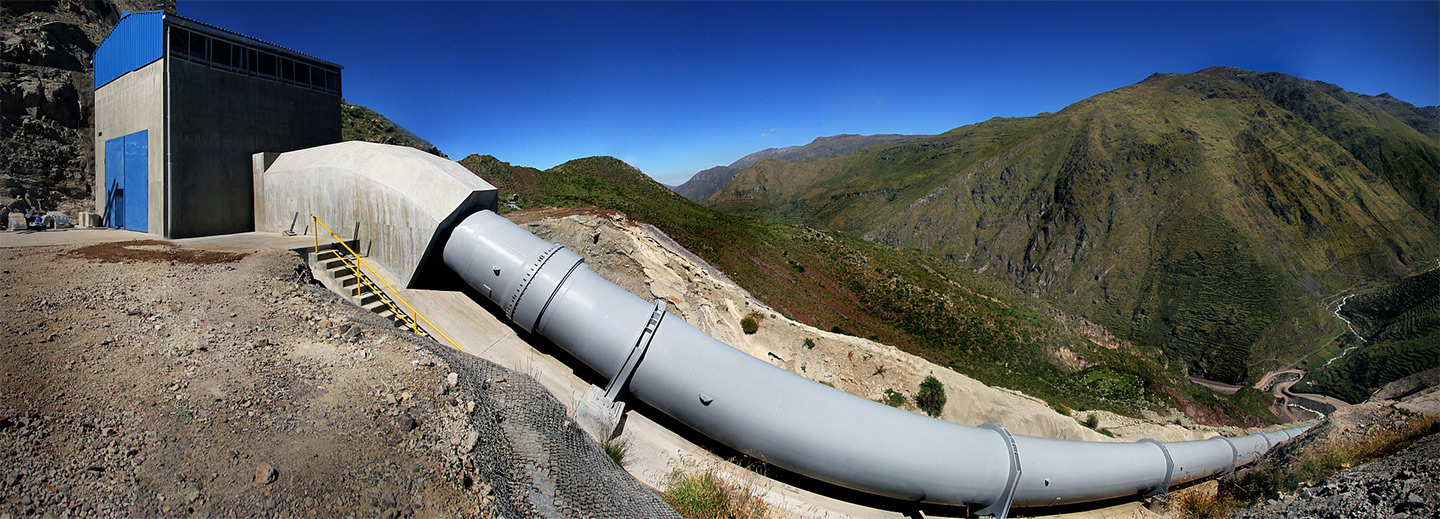
Figure 8.5: Data is first injected in the pipeline (Hydroelectric power station, Huanza, Peru.)
The beginning of the pipe needs to start the “injection” of data. In the example we started with Master4 which is a very large dataset:
Master4 %>%: the implied function here is print() which is a command performing an action.
However, we could also have started with:
select(Master4, SEQN, LBXMFOS, URXUCR, BMXBMI) %>%: in this case the Master4 data is within the query function select().
But in both cases we have data starting to stream down the pipeline.
filter(!is.na(LBXMFOS)) %>% uses a logical operator (Appendix B.4) to remove the rows that have NA within the LBXMFOS column. ! is negating the next statement is.na that checks if there is an NA value. This can be read in English as “is not NA”. This is a query.
# head() %>% is commented out and can be used for testing and just show the first 6 lines of data passing through. It does not hamper the pipeline to have a line commented out. Actual comments of explanation could therefore be included along the pipeline. head() is a command that would end the pipeline for testing.
mutate (RATIO = (LBXMFOS/URXUCR)*10^-4) %>% computes the creatinine adjustment as was detailed in section 7.4 using the same formula. A new column named RATIO will be created to store the computation, just as it was done in base R. This is a query.
qplot(log10(RATIO), BMXBMI, data = ., geom = c("point", "smooth")) will make the plot, with default regression curve (to compute a linear model line see section 7.5.2. The geom potion could be removed to just get the points.)
The option data = . may appear “strange” and we have not seen this yet. Since we are in a pipeline, the data is symbolically represented by the dot . which is useful, otherwise how would we specify where the data came from?
Did we follow the pipe rules? Overall yes!
qplot is first a command that will perform the action of creating a plot. However, this function as well as its bigger version qqplot2() were created before the Tidyverse, and does not adhere completely to those rules as internally there will be some computation (hence query) to create the regression line or curve. However, one could argue that since the plotting of the line could be the final step, that would be the result of a command.
Hadley Wickham is the Chief Scientist at RStudio, a member of the
RFoundation, and Adjunct Professor at Stanford University and the University of Auckland. He builds tools (both computational and cognitive) to make data science easier, faster, and more fun. He develops packages for data science.↩︎https://rviews.rstudio.com/2017/06/08/what-is-the-tidyverse/↩︎
https://github.com/rstudio/rstudio-conf/blob/master/2017/The_Tidyverse-Hadley_Wickham/tidyverse.pdf↩︎
https://rstudio.com/resources/rstudioconf-2017/data-science-in-the-tidyverse-hadley-wickham/↩︎
https://rstudio.com/resources/rstudioconf-2017/writing-readable-code-with-pipes/↩︎
